
50th Anniversary campaign concept adapted into brand and photography for digital, print and in-store rollout.
Creative direction & print-ready artwork across campaign touchpoints
Visual brand re-alignment to improve consistency across customer-facing assets
Collaborative creative support with internal teams across campaign production
Lead Product Photography to support on-going social media and in-store campaigns and document stake-holder events

- Claire Ducker, Marketing Manager, Hugh Rice LTD.
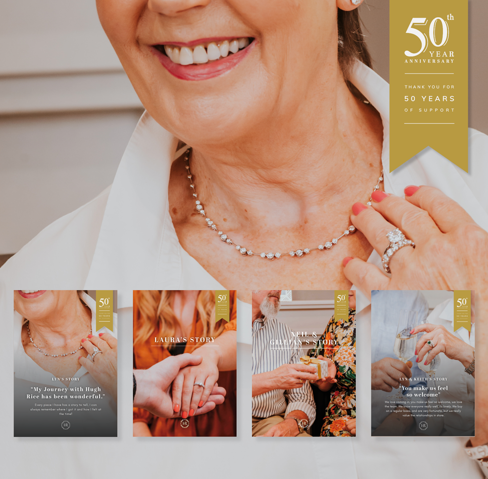
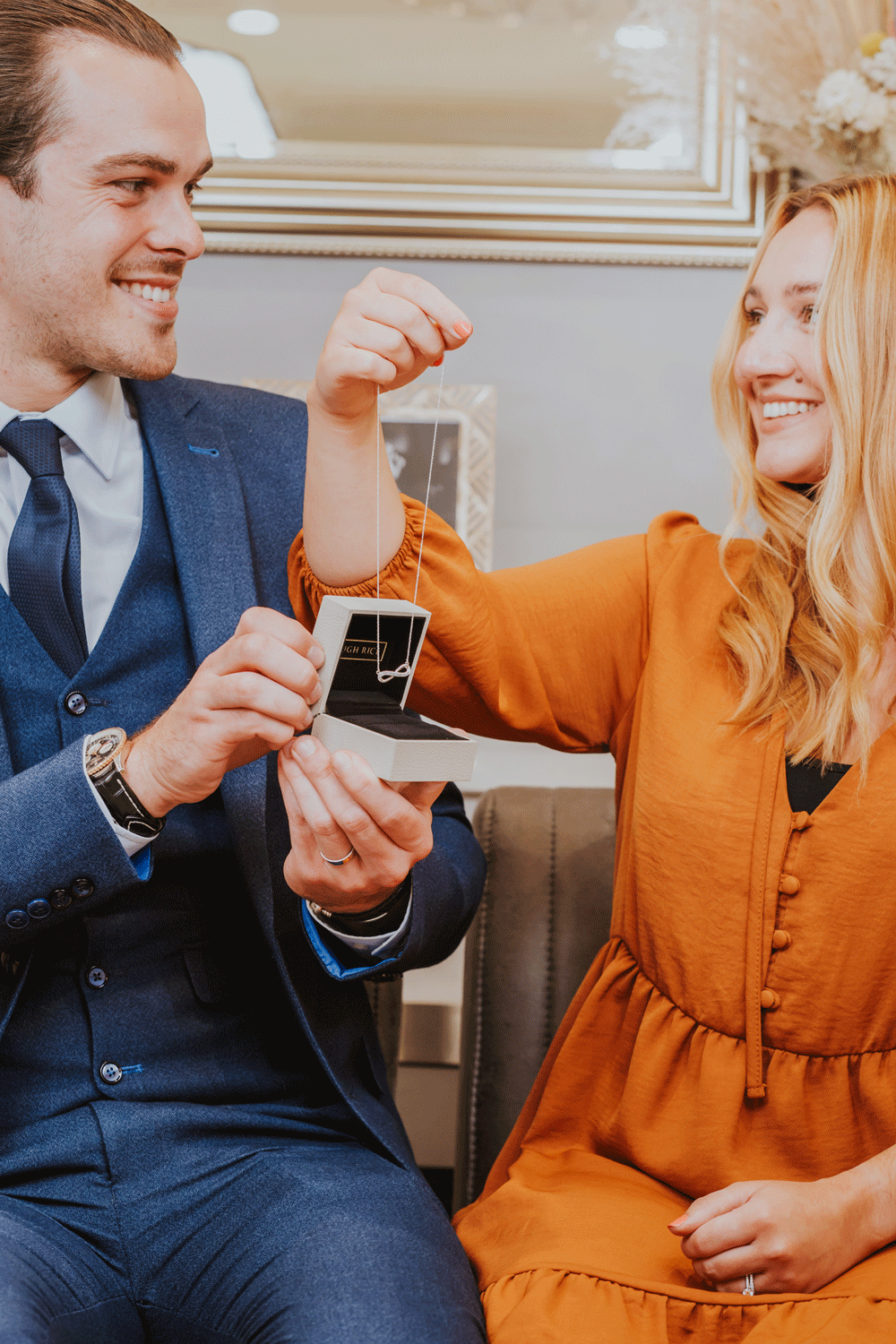
To celebrate Hugh Rice’s 50th year, the campaign focused on authentic customer stories and the emotional significance of jewellery across generations.
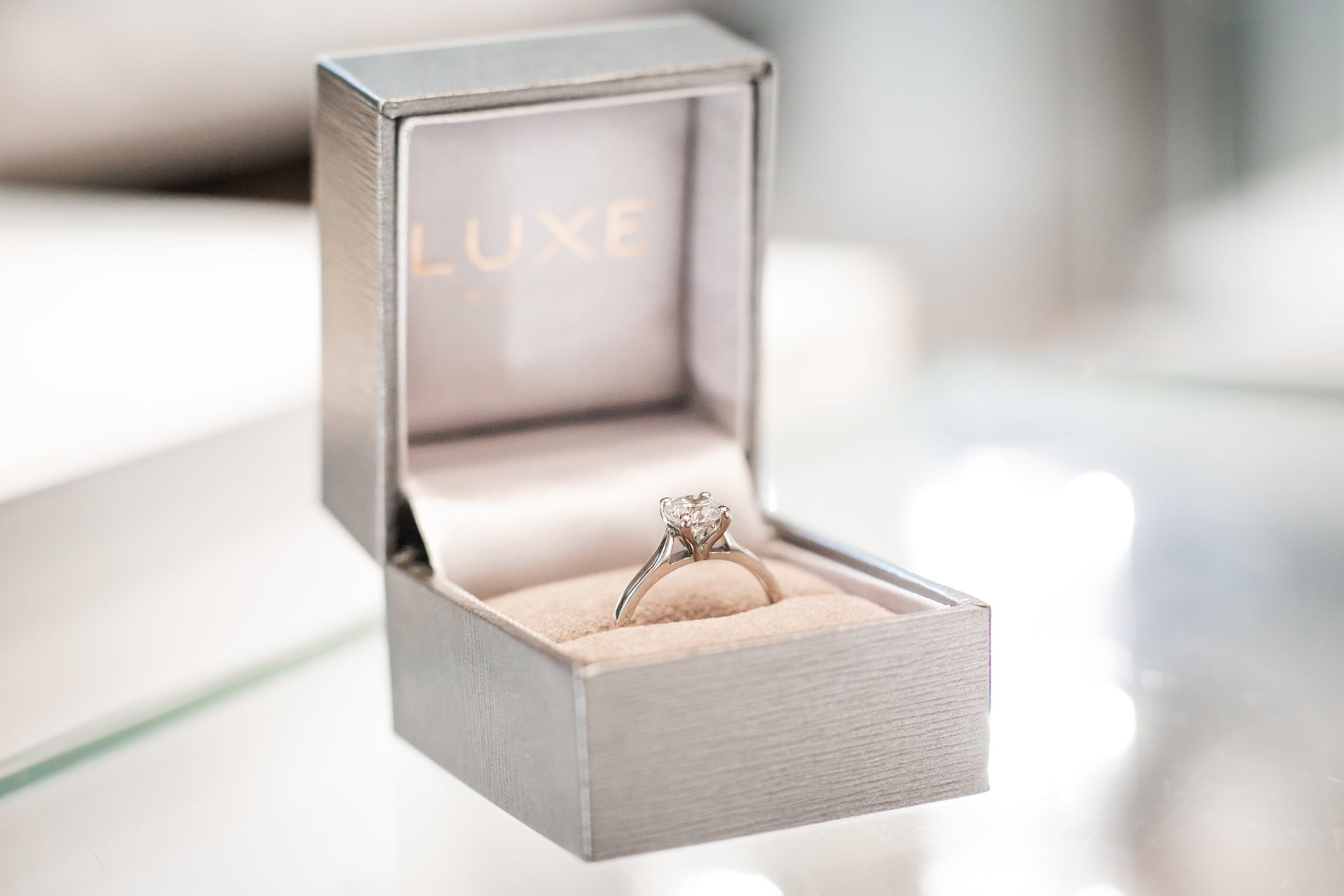
The creative direction leaned into warmth, familiarity and real interactions rather than traditional luxury advertising. Real customers were featured throughout the campaign, requiring a sensitive and personable approach to storytelling and image-making. Studio Blue’s role included campaign concepting, creative direction, lead photography, print-ready artwork and asset production across digital and retail formats.


Studio Blue also supported a wider brand realignment across Hugh Rice and Luxe by Hugh Rice, helping refine visual consistency and simplify how the brands communicated across print and digital platforms.
The work also helped organise and streamline internal brand systems, creating a more cohesive customer experience and a clearer, more accessible brand presence online.
Client
Work
Year


Tomorrow

